Brand
Logo & Branding Design Trends 2026 (What Actually Matters)
After two years of AI sameness, the logo design trends 2026 rewards are the opposite: identities that move, feel human, and stand apart. The 5 shifts that matter.
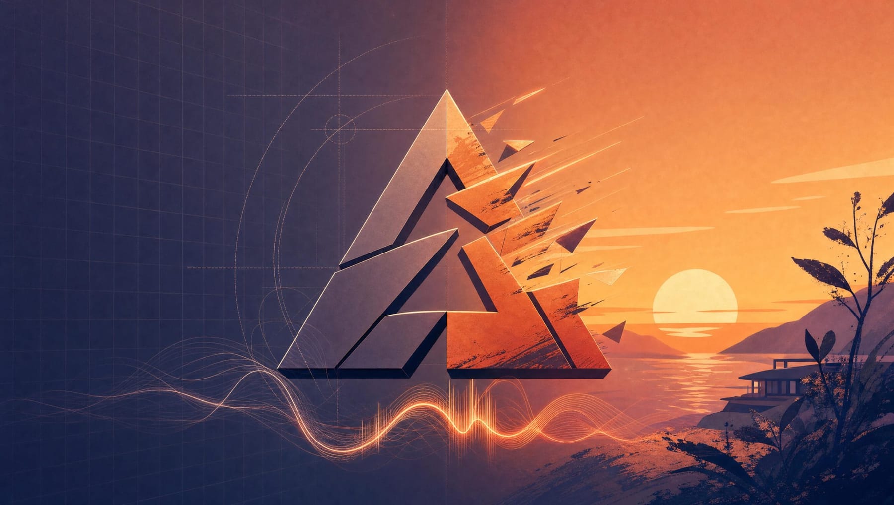
Somewhere in the last eighteen months, a great many brands began to look like one another. Put a dozen recent rebrands side by side and you can almost hear the same brief being read aloud: clean sans-serif, generous spacing, a friendly geometric mark, a palette borrowed from a wellness app. The design critic at Creative Boom summed up the mood by describing a rise in safe, forgettable branding: work that isn’t exactly bad, just utterly unremarkable.
That flatness is what 2026 is reacting against. After a couple of years in which artificial intelligence flooded the world with competent, interchangeable visuals, the most interesting development in branding this year is a hunger for the opposite. People want identities that move, feel made by a human hand, and are distinct enough for an algorithm to tell apart. The era of the single, frozen logo has quietly ended.
Below are the shifts that matter and, more usefully, what each one is actually for.
1. The logo that refuses to sit still
The defining structural change of 2026 is the move from a fixed mark to a flexible system. Designers have stopped treating “the logo” as one file and started thinking about how a logo behaves: how it scales, animates and rearranges itself across a phone screen, a billboard and a video bumper. The annual LogoLounge 2026 Trend Report, based on a review of more than 30,000 identities, describes a system that feels “more fluid than ever, less fixed, less precious,” with brands no longer just presenting themselves but behaving.
In practice this means adaptive marks: a detailed lock-up where there’s room, a stripped pixel-sharp version for a favicon, a moving variant for screens. Major brands have run versions of this for years. What’s new is that it has trickled down and become the default expectation for ambitious smaller companies too.
What to take from it: define a strong, recognisable core form first, then design the variations around it. Flexibility without a fixed centre is just inconsistency with better lighting.
2. Motion and sound enter the chat
If a brand now lives mostly inside feeds, reels and short video, a static logo is using only half its voice. The trend reports agree that motion design and sonic branding (short signature animations and audio cues) are moving from luxury to baseline. The Branding Journal‘s 2026 design forecast treats identities as multi-sensory, covering how a brand looks, how it moves and even how it sounds.
What to take from it: even a small brand benefits from deciding how its mark animates on a loading screen or a video intro. It’s the cheapest way to feel current in a video-first world.
3. The human counter-swing: imperfect, hand-made, warm
Every push toward fluid digital systems comes with an equal craving for the tactile. Across 2026 forecasts the same vocabulary keeps appearing: grain, texture, collage, zine culture, hand-drawn marks, “naive” doodles. Kittl’s trend analysis and The Branding Journal both read this as a direct reaction to AI polish. Work that looks handmade and a little imperfect now signals something machine-made cannot, which is sincerity.
The smart application, as Kittl puts it, is restraint. Keep the core mark clean and professional, then add a hand-drawn element as seasoning: a doodle on the corner of a polished notebook, not the whole notebook in crayon.
What to take from it: a touch of visible authorship, such as a hand-drawn accent or a real texture, is one of the fastest ways to look human in an automated feed.
4. Flexible colour and expressive type
Two supporting trends round out the year. First, palettes are loosening: instead of three rigid hex codes, brands increasingly define a colour mood that can shift across contexts while staying recognisable. Second, typography is getting loud. Shopify’s 2026 logo round-up points to maximalism, funky and retro typefaces, and 2000s nostalgia, while elsewhere “type collage” wordmarks behave like miniature posters. The catch, as ever, is legibility: a dramatic display wordmark needs a quiet, simplified twin for the places where nobody can read typographic theatre.
5. The trend beneath the trends: designing to be recognised by machines
The least visible but most consequential shift is strategic. As AI assistants increasingly filter and recommend products on people’s behalf, Interbrand and others argue that brands now have to prove credibility to algorithms as well as to humans. A coherent, distinctive identity is also more legible to the systems deciding what gets surfaced, on top of looking better.
How to actually use any of this
Every credible 2026 report ends on the same warning, and it bears repeating: trends are tools, not rules. The strongest identities this year didn’t chase the most trends. They picked the one or two directions that fit the brand’s character and executed them with intent. A fluid system is wasted on a business that needs a stamp of authority, and hand-drawn warmth is wrong for a brand selling precision.
The throughline of 2026 (distinctiveness over sameness, behaviour over stasis, human warmth over machine polish) is really a return to first principles in new clothes. A logo still has to be clear, relevant and built on strategy. When those fundamentals are solid, a trend becomes a powerful layer. When they’re missing, it’s just a costume.
That’s the lens we bring to every identity at MalbarDesign: read the moment, borrow what fits the brand, ignore the rest, and build something that will still look intentional in five years. If your mark is starting to feel like everyone else’s, tell us where your brand wants to go and we’ll help it stand out on purpose.
If you’re weighing up which kind of mark to commission before worrying about trends, start with the seven types of logos and which one fits your business.
FAQ
Q: What are the biggest logo design trends in 2026?
The headline trends are adaptive “living” logo systems that flex across contexts, motion and sonic branding becoming standard, a strong counter-movement toward hand-made and imperfect human warmth, flexible colour “moods,” and expressive maximalist typography. Underpinning all of them is a strategic push toward distinctiveness as AI floods the market with sameness.
Q: Should a small business follow logo trends?
Selectively. Trends are tools, not rules. Pick the one or two directions that genuinely fit your brand’s character and ignore the rest. Chasing every trend produces a logo that looks dated the moment the trend passes; building on clear strategy makes a trend a useful layer rather than a costume.
Q: What is an adaptive or dynamic logo?
It’s a logo designed as a system rather than a single fixed file. A strong core form stays constant for recognition, while variations adapt for different contexts: detailed where there’s space, simplified for small screens, animated for video. Most established brands now run their identity this way.
Q: Is AI replacing logo designers in 2026?
AI has made competent, generic visuals cheap, which is precisely why distinctive, human-led design has become more valuable, not less. The 2026 trend toward imperfect, hand-made, authored work is a direct market reaction to AI sameness. AI is a tool in the process; brand strategy and judgement remain human.
Q: How often should a brand update its logo?
There’s no fixed clock, but a mark that suddenly looks like every competitor’s, or that can’t flex across modern digital surfaces, is a signal. Rather than chasing trends on a schedule, refresh when your identity stops being distinctive or stops working where your brand now lives.
Sources
- LogoLounge: 2026 Logo Trend Report
- The Branding Journal: Top Branding & Design Trends for 2026
- Kittl: Logo Design Trends 2026
- Shopify: Logo Trends for 2026
- Wix: Logo Design Trends
- Envato Elements: Logo and Branding Trends 2026
FAQ
Questions people ask
What are the biggest logo design trends in 2026?
The headline trends are adaptive living logo systems that flex across contexts, motion and sonic branding becoming standard, a counter-movement toward hand-made human warmth, flexible colour moods, and expressive maximalist typography, all underpinned by a strategic push toward distinctiveness as AI floods the market with sameness.
Should a small business follow logo trends?
Selectively. Trends are tools, not rules. Pick the one or two directions that genuinely fit your brand's character and ignore the rest. Chasing every trend produces a logo that looks dated the moment the trend passes; building on clear strategy makes a trend a useful layer.
What is an adaptive or dynamic logo?
It's a logo designed as a system rather than a single fixed file. A strong core form stays constant for recognition while variations adapt for different contexts: detailed where there's space, simplified for small screens, animated for video.
Is AI replacing logo designers in 2026?
AI has made generic visuals cheap, which is precisely why distinctive, human-led design has become more valuable. The 2026 trend toward imperfect, hand-made work is a direct reaction to AI sameness. AI is a tool; brand strategy and judgement remain human.
How often should a brand update its logo?
There's no fixed clock, but a mark that suddenly looks like every competitor's, or that can't flex across modern digital surfaces, is a signal. Refresh when your identity stops being distinctive or stops working where your brand now lives.
Not sure whether your brand needs a refresh or a rebuild?
Ask for the free 5-point brand check: concrete recommendations for your logo and website within 48 hours, no sales call unless you want one.
Related articles
All articles Brand
BrandWhy Every Logo Looks the Same in 2026 (And How to Fix It)
Ten company logos, described from memory, and most people can’t tell them apart. Blandification has a name now, and the industry is finally reacting against it.
· 6 min read
 Brand
BrandQuiet Confidence or Dopamine Design? 2026 Trend Test
2026’s web trends split in two: neon dopamine design and quiet, grain-textured restraint. Which fits your brand depends on the decision your buyer is making
· 5 min read
 Brand
BrandHow to Launch a Rebrand Without Losing Your Customers
The files are delivered, and now comes the part that decides everything: the switch. The 215-asset inventory, the bridge period, the inside-out sequence, and the 30-day scoreboard.
· 4 min read