Brand
What Actually Goes Inside a Brand Style Guide (and Why Most Small Businesses Skip It)
What goes in a brand style guide (logo rules, colour palette, typography, imagery and tone) plus the minimum viable brand guidelines every small business actually needs.
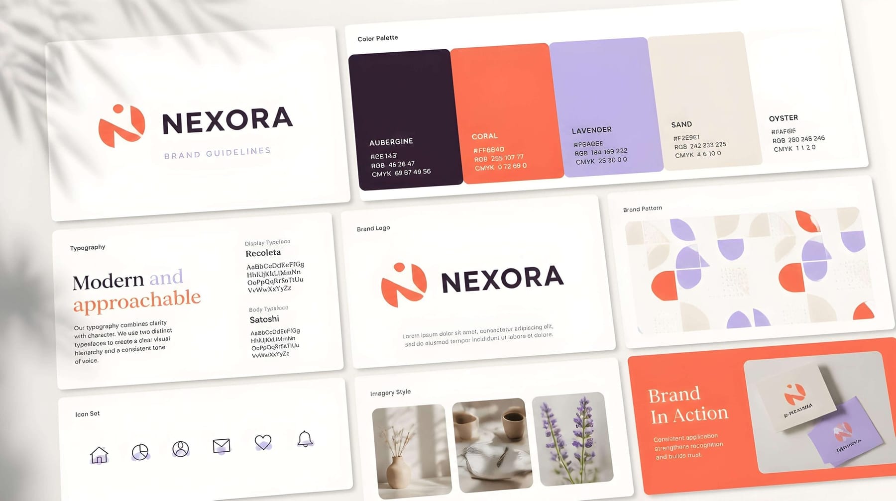
Without a brand style guide you aren’t saving money. You are paying a hidden tax. Every new designer re-guesses your colours, every printer eyeballs your logo size, and team members improvise fonts. The result is a brand with four personalities, and that is expensive in the way that matters most: a brand that looks inconsistent looks unsure of itself, and customers read uncertainty as risk.
The upside is real. Brands that stay visually consistent across every channel are recognised far faster and trusted more readily than brands that drift. A style guide is simply the mechanism that makes consistency possible once more than one person (or more than one mood) is creating things in your name.
It also multiplies your effort. Hand a freelancer your guidelines and they are productive in an hour instead of a week. The guide becomes your brand’s source of truth and keeps working when you’re not in the room.
The essential sections (the minimum viable brand guide)
You don’t need the 200-page tome that global corporations produce. For most small and growing businesses, a focused guide of a handful of pages covers everything that matters. These sections are the non-negotiables.
1. Brand story & basics. A short section on who you are: mission, the values behind the brand, your positioning, and who you’re for. This is the “why” that makes every later rule make sense. Most guides skip it, even though it is what stops your brand from turning into a soulless set of swatches. A new designer who understands the spirit makes better calls in the grey areas no rulebook can cover.
2. Logo usage. This is the heart of the guide. Show your primary logo and any secondary or simplified versions, then spell out the rules: minimum size, clear space around it, which backgrounds it can sit on, and, crucially, a “don’ts” page showing the abuses to forbid (stretching, recolouring, adding effects, putting it on a busy photo). The don’ts page is the one that saves your logo’s life.
3. Colour palette. List every brand colour with its exact values: HEX for screen, RGB, CMYK for print, and ideally a Pantone reference. Note which colour is dominant, which is secondary and which is the accent, so the palette is applied with intent rather than at random. (If you haven’t finalised yours, start with how to choose brand colours that don’t look generic.)
4. Typography. Name your heading and body fonts precisely, with weights, sizes and the hierarchy for headings, subheadings and body text. Add a web-safe fallback so the system survives outside design software. (Our guide to brand guidelines fonts covers how to choose them in the first place.)
5. Imagery & graphic style. Give direction rather than a photo library. Show two or three images that capture the type of visuals your brand uses, whether bright and airy, moody and cinematic, or candid and human, along with any icon style, illustration approach or recurring graphic elements. A short note explaining the mood guides every future choice.
6. Voice & tone. Your brand has a way of talking, and it should be written down. Formal or warm, playful or precise: a few do/don’t example sentences are worth a page of adjectives, and they keep your emails, captions and headlines sounding like one consistent person.
The sections that take a good guide to a great one
Once the essentials are in place, these extras pay off as you grow:
Real-world examples. A few mockups put the rules in context (a business card, a social post, a slide, an email signature), so people see the brand assembled correctly instead of only reading about it.
Logo file & asset access. Add a note on where the master files live and which format to use where, so nobody ever emails you at 9pm asking for “the logo for the printer.” (If that sentence made you wince, here’s exactly which logo file to use when.)
Packaging, merch & environment. If your brand shows up on shipped boxes, uniforms, signage or vehicles, give those rules too. The brand experience continues past the website, and a beautifully wrapped package is part of it.
Treat it as a living document
There is one rule about the rulebook: it should evolve. A style guide isn’t carved in stone. You update it as your brand grows, add sections as new touchpoints appear, and refine it as you learn what your audience responds to. Don’t change it on a whim (that defeats the point), but do keep it current. A guide nobody updates becomes a guide nobody uses.
Keep it usable as well. The best brand guide in the world is worthless if it lives as a forgotten PDF on one laptop. Make it easy to find, easy to navigate (a table of contents helps), and easy for every contractor, employee and vendor to access. A guide’s whole job is to be reached for.
Where this leaves you
If your brand currently has four personalities, another redesign won’t fix it. Writing down the brand you already have will, because it stops the drift. A focused style guide is the cheapest, highest-leverage branding investment most small businesses never make.
We build guides properly, capturing the spirit and codifying every rule so your brand finally looks like one brand everywhere. At MalbarDesign it is part of every identity project, and we also offer it as a standalone deliverable for businesses that have the pieces but not the rulebook. If you’re tired of your brand looking like four companies, tell us what you’re working with and we’ll help you make it one.
FAQ
Questions people ask
What is a brand style guide?
A brand style guide (also called brand guidelines or a brand book) is a rulebook for how your brand looks and sounds. It documents your logo usage, colours, typography, imagery style and tone of voice so that anyone creating materials for your brand produces a consistent result every time.
What should a brand style guide include?
At minimum: a brand story and positioning, logo usage rules (including a “don’ts” page), the colour palette with exact values, typography with weights and hierarchy, an imagery and graphic style direction, and voice-and-tone guidelines. Larger guides add real-world mockups, asset access notes and rules for packaging or environments.
How long should a brand style guide be?
There’s no fixed length. Global corporations produce extensive guides, but most small and growing businesses are well served by a focused document of just a handful of pages that covers logo, colour, typography, imagery and tone. Clarity matters more than page count.
Do small businesses really need brand guidelines?
Yes, arguably more than large ones. The moment more than one person creates anything in your name, consistency starts to drift. Guidelines stop that drift, make freelancers productive immediately, and ensure your brand is recognised and trusted across every channel.
What’s the difference between a brand style guide and a logo?
A logo is one asset; a brand style guide is the rulebook governing that logo and everything around it: colours, fonts, imagery and voice. The logo shows what your brand looks like in one place; the guide ensures it looks and sounds like itself everywhere.
Not sure whether your brand needs a refresh or a rebuild?
Ask for the free 5-point brand check: concrete recommendations for your logo and website within 48 hours, no sales call unless you want one.
Related articles
All articles Brand
How to Launch a Rebrand Without Losing Your Customers
The files are delivered, and now comes the part that decides everything: the switch. The 215-asset inventory, the bridge period, the inside-out sequence, and the 30-day scoreboard.
· 3 min read
 Brand
The DIY Brand Audit: Score Your Brand in One Afternoon
Before spending a euro on design, spend an afternoon on diagnosis. The exact 5-test brand audit we run professionally, simplified for coffee, honesty, and one stranger.
· 3 min read
 Brand
From Startup Brand to Company Brand: Rebranding After Traction
The scrappy identity that won your first hundred customers is costing you the next thousand. When to rebrand a startup, what actually changes, and the founder’s playbook.
· 3 min read