Brand
The Quiet Power of Brand Fonts: How Typography Decides Whether People Trust You
Brand fonts persuade long before anyone consciously notices them. How to choose typography that builds trust: serif vs sans-serif, the rule of two, font pairing, plus licensing and speed checks.
MalbarDesign creates original, strategic logos for businesses that take their brand seriously.
Read these two words out loud in your head: luxury and luxury. Same word, same meaning. But if we set the first in a thin, high-contrast serif and the second in a chunky rounded sans, your gut would tell you two completely different stories about the company behind them. One feels like a boutique hotel, the other like a kids’ yoghurt. You didn’t decide that. Your brain did it in milliseconds, before you read a thing.
That is the strange, underrated power of typography. Brand fonts do an enormous amount of persuading before anyone consciously notices them. They set tone, signal price, suggest era and quietly tell people whether to trust you. Yet font choice is the part of branding most often left to “whatever looked nice in the dropdown.”
If colour is your brand’s mood, type is its voice. Here is how to choose one that says the right thing.
First, understand what the big font families signal
You don’t need to be a typographer to make a good call. You do need to know the broad emotional territory each style of type occupies.
Serifs (the fonts with little feet on the letters, such as Times, Garamond and Playfair) read as established, trustworthy, traditional and editorial. They carry centuries of books and newspapers behind them, so they whisper credibility and heritage. Law firms, universities, luxury and publishing reach for them for a reason.
Sans-serifs (no feet: Helvetica, Inter, Montserrat) read as modern, clean, direct and approachable. They’re the default voice of tech and contemporary brands because they feel current and get out of the way. The risk is that they’re so common a generic sans can make you invisible.
Slab serifs (chunky, blocky feet: Rockwell, Roboto Slab) feel sturdy, confident and a little bold. They suit brands that want to seem solid and unfussy.
Scripts and handwritten fonts feel personal, elegant or playful depending on the cut. Used in tiny doses they add warmth; used as body text they become unreadable and amateur. Treat them like a spice, not a meal.
Display fonts are the characterful, attention-grabbing faces built for headlines only. They can give a brand a singular personality, but a display face doing a body-text job is one of the most common own-goals in amateur branding.
Neither serifs nor sans-serifs win by default. Every family arrives carrying baggage, and your job is to pick the baggage that matches the feeling you defined for your brand.
The rule of two (maybe three)
The most common typography mistake we see is too many fonts. A homepage with five typefaces ends up looking like a ransom note instead of rich, and it quietly erodes trust because nothing feels deliberate.
A clean, professional system usually needs just two fonts:
- A heading font with personality. This is where your brand’s character lives.
- A body font chosen for pure readability. This is where it earns the right to be read.
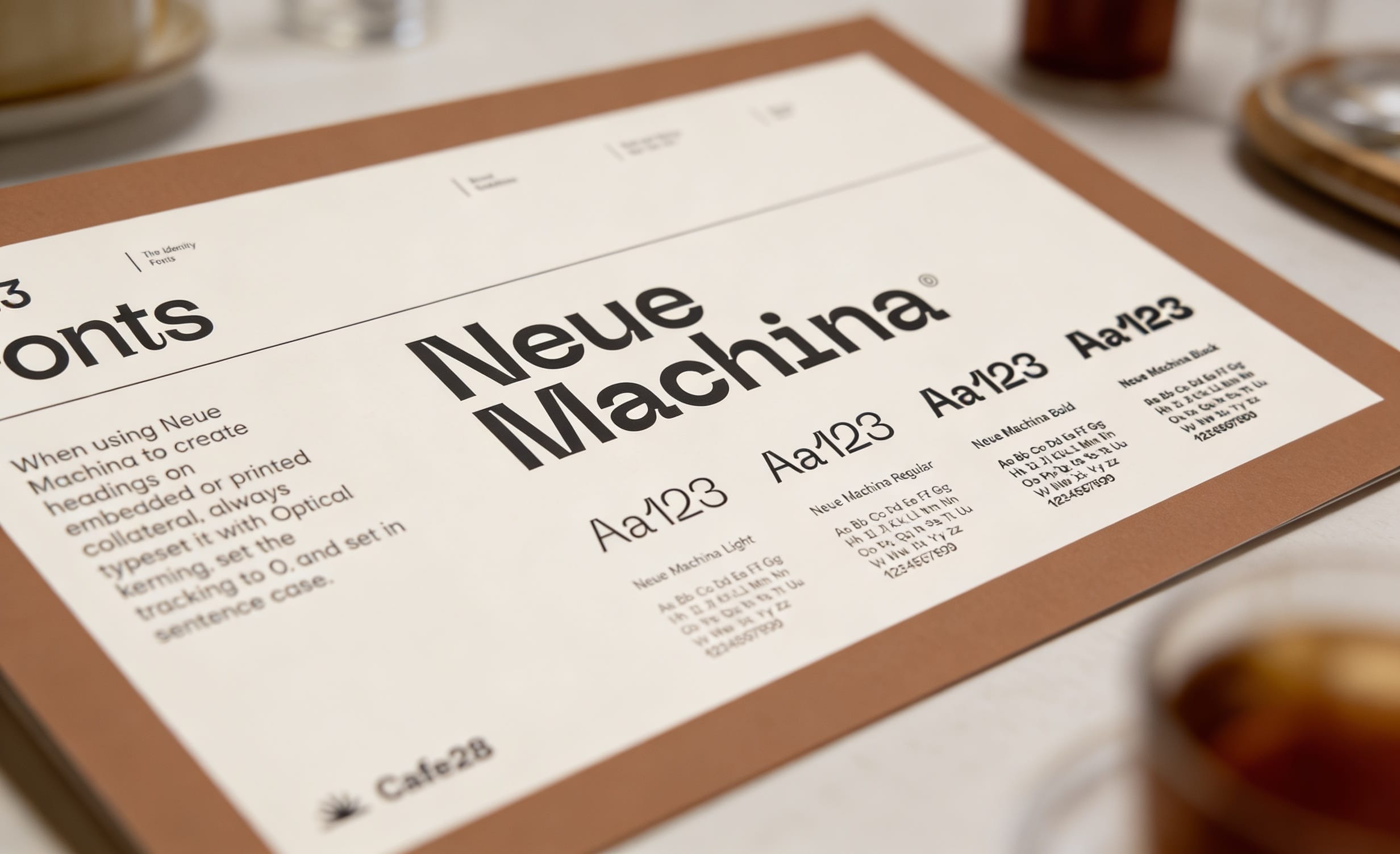
Three is the absolute ceiling, and the third should have a clear job (say, a small accent face for quotes or labels). Many of the strongest brand systems use exactly one typeface family with multiple weights (light, regular, bold, black), which gives you all the hierarchy you need with perfect consistency and zero clashing.
How to pair fonts without the headache
Good pairing is mostly about contrast with harmony. The two fonts should be clearly different so the hierarchy is obvious, without fighting each other.
Three pairings that almost always work:
- Serif heading + sans-serif body. A classic. The serif gives gravitas to headlines, and the sans keeps long text effortless to read. (This is why so many editorial brands look the way they do.)
- Sans heading + serif body. The modern inversion: a confident sans headline over warm, readable serif paragraphs. Great for brands that want to feel current but human.
- One family, many weights. A bold weight for headings, a regular for body. Foolproof, endlessly consistent and impossible to clash.
What to avoid: two fonts that are almost the same (two similar sans-serifs look like a mistake rather than a choice), and anything you can’t read comfortably at small sizes on a phone.
Make it work everywhere, including where you can’t install fonts
A font that’s only licensed for print, or only lives on your designer’s machine, will betray you the moment your assistant opens PowerPoint. Run these practical checks before you commit.
Licensing. Make sure your fonts are licensed for everywhere you’ll use them: web, app, print, embedded in documents. “Free for personal use” is not a brand licence.
Web-safe fallbacks. If your heading font is a premium face, define a close system-font fallback so a slow connection doesn’t break the layout. (And remember that every custom web font is a file your visitor must download, which costs load time, so choose with one eye on page speed.)
Readability at the extremes. Test your body font as a long paragraph on a small phone screen, and your heading font scaled down to a caption. If either makes you squint, reconsider.
The “no-design-software” test. Your team will use these fonts in emails, slide decks and social tools with no designer present. The system has to survive ordinary people using ordinary apps, which is one more reason to keep it simple.
Write it down, or watch it drift
Choosing the fonts is half the job. The other half is making sure they’re actually used: by you next month, by a freelancer next year, by the printer who’s never met you. That means recording the exact font names, weights, sizes and hierarchy in a brand style guide, so your brand sounds like itself everywhere. (Here’s what a brand style guide should contain.)
Type also never works in isolation. It is locked in a constant duet with your colours, and together they decide your brand’s whole personality before a word is read. If you haven’t settled your palette yet, start with how to choose brand colours that don’t look generic.
Getting typography right is deceptively hard. Small, invisible decisions add up to whether a brand feels expensive or cheap, trustworthy or improvised. Typography is a core part of every identity we build at MalbarDesign: type chosen for what it says, paired for harmony, and documented so it never drifts. If you’d like a brand voice that reads as confidently as it sounds, let’s talk about your branding project.
Brand typeface, brand font, brand typography: what is the difference?
People use the three terms as if they were one thing. They are not, and the distinction matters when you brief a designer or write guidelines.
- Brand typeface is the type family you own the rights to use: Inter, Freight, Söhne. One family, many weights.
- Brand font is a specific cut of that family at a specific size and weight: Inter Semibold 18 px for subheads. Fonts are the files; the typeface is the design.
- Brand typography is the whole system: which typeface does what job, the sizes, line heights, letter spacing and the rules for pairing. Typography is what makes two pages feel like the same company.
- Logo font is a separate question. The logotype is usually custom-drawn or heavily modified, so it should not be reused as the body font. A logo set in the same face as every paragraph loses its status.
How many fonts should a brand have?
Two. One typeface with personality for headlines and one quiet, highly legible typeface for body copy and interfaces. That pairing covers 95 % of brands we have worked with since 1992.
One typeface works for tightly focused brands when the family is large enough (a superfamily with eight or nine weights, or a serif and sans drawn to match). Three is the maximum, and the third face needs a narrowly defined job such as code, captions or a single campaign. Four or more is not a system, it is a mood board, and your audience reads it as indecision.
Brand guidelines fonts: what to document in your style guide
A font decision only survives if it is written down. The typography page of a brand guide, even a one-page one, should state:
- The families and where to get them. Exact names, the foundry or Google Fonts link, who holds the licence and what it covers (desktop, web, app, embedding).
- Roles. Which face is for display, which for body, which for interface and data. Add the weights allowed for each role; four to five weights in total is plenty.
- A type scale. Sizes and line heights for H1 to H4, body, small print and buttons on web and in print. A scale stops every new document from inventing its own hierarchy.
- Spacing rules. Letter spacing for capitals, paragraph spacing, maximum line length (45 to 75 characters).
- Fallbacks. The system fonts used when the brand font cannot load, in e-mail signatures, in Office templates and on slow connections.
- Don'ts. Stretching, faux bold, faux italic, outlines and the substitute fonts that are not acceptable.
Example: the fonts page of a brand style guide
TYPOGRAPHY
Display:     Fraunces, Semibold 600 / Bold 700 (Google Fonts, SIL Open Font License)
Body and UI: Inter, Regular 400 / Medium 500 / Semibold 600 (Google Fonts, SIL OFL)
Web scale:   H1 48/56, H2 32/40, H3 24/32, body 17/28, small 14/20 (px)
Line length: max. 70 characters
Fallbacks:   Georgia for Fraunces, Arial for Inter (email, Office templates)
Never:       stretched type, faux bold, outlined text, substitute fonts
Six lines like these settle more arguments than a forty-page PDF nobody opens. Any freelancer, printer or new colleague can set a document in your brand typography without asking.
We cover the rest of the document in what goes in a brand style guide. If you have no guide yet, our Basic Logo Guide add-on (€105) documents the logo on light and dark backgrounds, its colour codes and typeface on two pages that any supplier can follow.
FAQ
Questions people ask
How many fonts should a brand use?
Two is the sweet spot: one heading font with personality and one highly readable body font. Three is the maximum, and the third needs a clear, limited job. Many strong brands use a single typeface family with multiple weights for perfect consistency.
What fonts should be in brand guidelines?
Brand guidelines should list every brand typeface by exact name, the weights allowed, which font does which job (headings, body, interface), a type scale with sizes and line heights, the licence details, and the system fonts to fall back on in email and Office documents. Most style guides need two fonts, three at most.
Should I use a serif or sans-serif for my brand?
It depends on the feeling you want. Serifs read as established, traditional and trustworthy, which suits law, finance, luxury and publishing. Sans-serifs read as modern, clean and approachable, the default for tech and contemporary brands. Match the style to your brand’s personality, not to fashion.
What fonts pair well together?
Three reliable pairings: a serif heading with a sans-serif body, a sans heading with a serif body, or a single family used in different weights. The goal is clear contrast with visual harmony, so avoid pairing two fonts that look almost the same.
Does font choice really affect how customers see my brand?
Yes, and faster than you’d think. Typography signals tone, price point, era and trustworthiness within milliseconds, before anyone reads the words. The same message in two different fonts can feel premium or cheap, established or improvised.
Do brand fonts affect website speed?
They can. Every custom web font is a file the visitor’s browser must download, which adds to load time. Choose efficient fonts, limit the number of weights you load, and define system-font fallbacks so the page stays fast and stable.
Not sure whether your brand needs a refresh or a rebuild?
Ask for the free 5-point brand check: concrete recommendations for your logo and website within 48 hours, no sales call unless you want one.
Related articles
All articles Brand
Quiet Confidence or Dopamine Design? 2026 Trend Test
2026’s web trends split in two: neon dopamine design and quiet, grain-textured restraint. Which fits your brand depends on the decision your buyer is making
· 4 min read
 Brand
How to Launch a Rebrand Without Losing Your Customers
The files are delivered, and now comes the part that decides everything: the switch. The 215-asset inventory, the bridge period, the inside-out sequence, and the 30-day scoreboard.
· 3 min read
 Brand
Why 2 Logo Directions Beat 10 Concepts, Every Time
“How many concepts do I get?” is the most revealing question in logo design. Why high concept counts signal uncertainty, and what a decision-led process looks like
· 3 min read