Web
The 5-Second Homepage Test: What Yours Must Say Instantly
Visitors interrogate homepages for about five seconds and leave when a question goes unanswered. The 5-second test, the three questions, and the above-the-fold checklist.
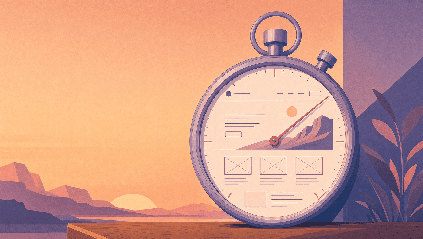
Visitors don’t read homepages. They interrogate them for about five seconds and leave the moment a question goes unanswered. Most homepages fail politely, in beautiful typography.
The 5-second homepage test works the way it sounds. You show a stranger your homepage for five seconds, take it away, and ask what the company does, who it’s for and what they’d do next. It’s an old usability method, and it is still the most useful quick diagnostic in web design, because it measures the one moment you can count on. Nielsen Norman Group’s classic research found users often leave pages within 10–20 seconds, and pages must communicate a clear value proposition fast to earn more time. Aesthetic judgment is even faster: first visual impressions form in as little as 50 milliseconds.
You get five seconds. What matters is how you spend them.
The three questions every homepage must answer
Before scrolling, in the first screen, a stranger must be able to answer:
What is this? In plain words. Skip “Empowering synergistic solutions” and write “We design logos, brands and websites for small businesses.” If your headline could hang above a competitor’s door, it works as decoration, not as a headline.
Is it for me? The visitor is scanning the sentence for themselves. Name the customer (“for ambitious small businesses”, “for Czech manufacturers selling abroad”), and the qualified visitors stay while the wrong-fit ones leave. Both outcomes help you.
What do I do next? One visible, unambiguous action. Four buttons of equal weight confuse people, so pick one primary step (“Get a free 5-point brand check”) and make everything else visually subordinate.
That is the whole exam. Everything else on the homepage exists to support these three answers, and anything that competes with them is expensive noise.
Why good companies fail it
The cause is almost never stupidity. It is insider blindness: the team knows what the company does, so the homepage stops saying it. We see three failure patterns again and again.
The clever headline. Wordplay the founder loves and no stranger can decode. Clarity beats cleverness in every test ever run, so keep the clever version for the campaign and out of the hero.
The mirror homepage. It is written about the company (“Founded in 1992, we are passionate about…”) rather than for the visitor’s problem. Nobody arrives wondering about your passion. They arrive wondering if you can fix their thing.
The buffet. Six services, three banners, two pop-ups, one carousel: the homepage as an argument between departments. When everything shouts, the visitor hears nothing and leaves within seconds.
The above-the-fold checklist
Here is what the first screen needs, and nothing more:
- Headline: what you do, for whom, in the customer’s vocabulary
- Subline: the outcome or proof (“websites engineered to be found, since 1992”)
- One primary CTA, verb-first, low-risk (“Get your free check” beats “Contact us”)
- One trust signal: client logos, review score, years, a number that’s true
- A visual that shows the work, not a stock handshake
Then run the jargon test on every word: would your customer say it out loud? “Solutions,” “innovative” and “synergy” go. Test the mobile fold first, because that is where most of your five seconds are actually spent.
Five seconds, then the compound interest
A homepage that passes the test keeps visitors, and it also feeds everything downstream. Clear headlines are what AI engines extract and cite. A single strong CTA is what turns the traffic you fought for into inquiries instead of applause. The websites that win in 2026 aren’t the loudest or even the prettiest. A stranger understands them before their coffee cools.
Wondering what your homepage says in five seconds? That is exactly what our free 5-point website check tells you. You can also see how we build websites that sell.
Sources
- Nielsen Norman Group, How Long Do Users Stay on Web Pages?: https://www.nngroup.com/articles/how-long-do-users-stay-on-web-pages/
- MalbarDesign, You’ve Been Judged in 0.05 Seconds (50 ms first-impression research): https://malbardesign.com/what-your-brand-is-saying-before-you-say-anything/
- MalbarDesign, Generative Engine Optimization (why clear headlines get cited): https://malbardesign.com/generative-engine-optimization-small-business/
FAQ
Questions people ask
What is the 5-second homepage test?
Show a stranger your homepage for five seconds, remove it, and ask three questions: what does this company do, who is it for, and what would you do next? If they can’t answer all three, the homepage is losing visitors it already paid to attract.
What should a homepage say first?
In the first screen: what you do in plain customer vocabulary, who it’s for, and one clear next step, supported by a single trust signal and a visual that shows real work. Everything else is secondary.
How long do visitors stay on a homepage?
Classic Nielsen Norman Group research shows users often leave within 10–20 seconds unless the page communicates a clear value proposition quickly; aesthetic first impressions form in as little as 50 milliseconds. The first screen carries nearly all the weight.
Why do homepages with great design still fail?
Usually insider blindness: clever headlines strangers can’t decode, copy written about the company instead of the visitor’s problem, or a “buffet” layout where six competing messages cancel each other out. Clarity beats cleverness and focus beats completeness.
How many calls to action should a homepage have?
One primary action, visually dominant and low-risk, with any secondary actions clearly subordinate. Multiple equal-weight buttons split attention and depress conversion.
Need a website that supports the brand instead of fighting it?
Hand-coded HTML sites from €1,060 and WordPress or Joomla builds from €1,800, up to 10 pages.
Related articles
All articles Web
Why Your Case Studies Aren’t Converting (And What Actually Fixes It)
Trust signals placed near a CTA lift conversion 34–42%. Most case study pages get almost none of this right. What the data says, and what actually fixes it.
· 4 min read
 Web
Will AI Agents Recommend Your Business? The New Trust Signals
73% of consumers now shop with AI agents. Agents don’t evaluate charisma; they evaluate data. The new trust signals, and the checklist to fix this month.
· 5 min read
 Web
Website Trust Signals: The 9 Elements Visitors Check First
Every visitor is a skeptic running a background check they’d never admit to. The 9 website trust signals they scan (identity, proof, safety) and the order to fix them.
· 3 min read