
The Cracker Barrel Lesson: Before You Touch Your Logo
A chief executive stepped down this month, and the reason traces back to a logo. Not a failed product. Not a financial scandal. A redesign. It sounds like an overreaction until you understand what brand equity actually is, and how quickly a company can spend it without noticing.
~8 min read
17.08.2026

Julie Masino, the chief executive of Cracker Barrel, leaves her post on August 10, 2026, paying the price, more than a year later, for a logo redesign that quietly removed a character customers had loved since 1977. The fallout was immediate at the time: roughly $100 million wiped off the company’s market value inside a week, a public rebuke from the sitting president, and a reversal within days. Two days before this piece went to press, Instagram made its own wordmark change, its first in a decade, and was mocked online within hours. The lesson isn’t that logos should never change. It’s that changing one without protecting what customers already feel they own has become a genuine business risk, not a footnote in a design brief.
Why this story is still happening
Cracker Barrel redesigned its logo in August 2025. Gone was Uncle Herschel, the old-timer leaning against a barrel who had sat beside the company name since 1977, replaced by a clean, modern wordmark. The backlash arrived within days: a week of fury on social media, saturation news coverage, a public rebuke from the sitting president, and a reported $100 million drop in market value. The company reversed course almost immediately. That should have closed the story. Instead, the chief executive who championed the redesign is stepping down this month, a year after the fact, replaced by the former head of Bloomin’ Brands. As Creative Bloq put it when the resignation broke: a bad logo can now cost you your job.
Two days ago, an entirely different brand ran into the same wall. Instagram shipped its first wordmark change in a decade on August 13: heavier, tighter, still in script. Within hours it was being read online as spelling “Instagzam,” because the tightened r sits too close to the g. Different scale, same mechanism. Touch what people feel they own, and they will tell you about it, loudly and fast.
Why this isn’t really about design quality
Here’s what should worry anyone who assumes good taste is protection enough: by the standards of the profession, Cracker Barrel’s new mark was a perfectly competent piece of work. Cleaner, more versatile, not remotely ugly. It failed anyway, because the backlash was never really about kerning or colour. It was a fight over competing ideas of what the brand meant, conducted through the language of design criticism. A Kellogg School analysis of the episode reaches a similar conclusion from the strategy side: in a media environment that rewards outrage, a small spark around any brand decision can now travel far further than the decision itself ever warranted. Good design remains necessary. It has never been sufficient.
What actually carries the risk: equity, not aesthetics
Every logo carries two things at once: its execution, meaning how it looks, and its equity, meaning the specific elements people have quietly decided belong to them. Uncle Herschel was never just an old-fashioned illustration to Cracker Barrel’s regulars. He stood for a particular, familiar kind of hospitality, and removing him read as erasure rather than modernisation.
Strip away the political noise and there’s a genuinely useful design lesson underneath, one that applies just as well to a business a thousand times smaller than Cracker Barrel. You can evolve the execution as aggressively as you like. You cannot strip out the equity without warning and expect nobody to notice. Careful evolution beats starting from scratch, and explaining the reasoning before launch beats managing the fallout afterward. It is advice that costs nothing to follow, and this month, cost a chief executive her job to ignore.
The process that would have caught this
This is why a properly run identity process tests before it launches, instead of launching and hoping for the best. Three checkpoints would have flagged Cracker Barrel’s risk long before a single dollar of media coverage went anywhere near it.
Name the equity before you touch anything. Not the vague sense that a brand feels dated, but the exact character, colour or shape a customer would notice missing. If an obvious answer comes to mind, that element gets evolved, not deleted.
Show the new direction to real customers before the world sees it. Not the boardroom, not the marketing team, but the people who actually buy from you, reacting honestly, while there’s still time to change course.
Explain the why before you reveal the what. The businesses that survive an identity change tell the story first: what changed, and why now. Leave that gap open and the audience will fill it with a story of their own. That is precisely what happened at Cracker Barrel within hours of the reveal.
There’s also a case here for fewer, stronger directions over a grab-bag of concepts. A rushed process with ten options optimises for picking something, not for testing whether the specific thing you’re about to remove is actually safe to lose. Two well-reasoned, equity-aware directions beat ten untested guesses, especially when one of those guesses turns out to cost a career.
The takeaway for a business nowhere near Cracker Barrel’s size
Odds are you’ll never face a presidential tweet over your logo. But the underlying mechanism scales down perfectly intact. Your regulars, your reviewers, your referral partners have all quietly decided that something specific about you belongs to them. A rebrand that respects that tends to survive. One that doesn’t finds out the hard way, just on a smaller stage.
Planning a rebrand and want the version that protects what you’ve already earned, rather than one that risks reversing it? See Brand Identity, or start with a free 5-point check, including what we’d flag as the equity worth protecting.
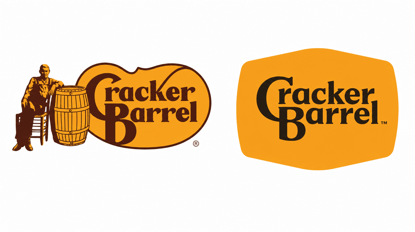
Cracker Barrel old brand and rebrand.
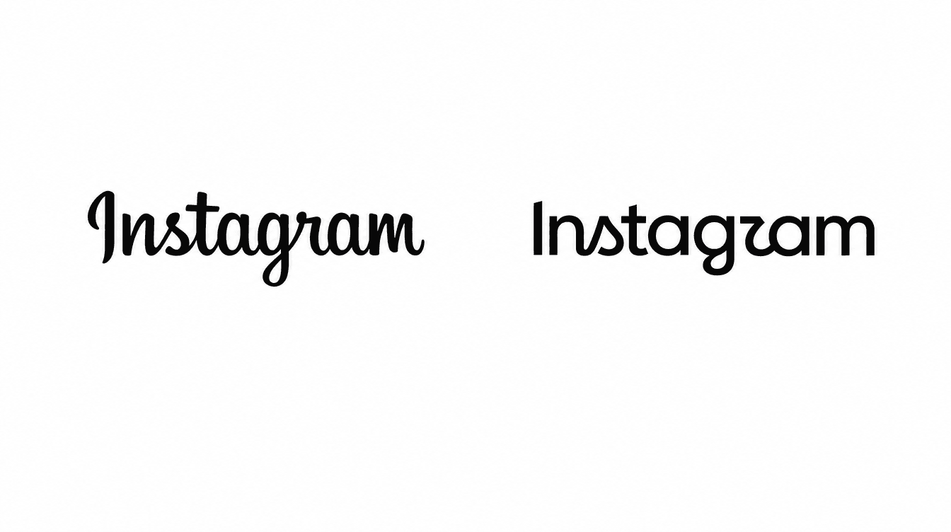
Instagram old brand and rebrand.
FAQ
In August 2025, Cracker Barrel redesigned its logo and removed Uncle Herschel, the character that had appeared beside the name since 1977. The backlash was swift: a reported $100 million drop in market value within a week, a public rebuke from the sitting president, and a reversal to the original logo within days. A year later, the chief executive who championed the change is stepping down.
Not because the design was poorly executed. It was competent by professional standards. The damage came from removing something customers had quietly claimed as their own, without warning, inside a media environment where a small controversy can spread far beyond what the original decision deserved.
Three things help: name the specific elements customers would miss before you touch a redesign, test the new direction with real customers before it goes public, and explain the business reason for the change before you reveal the new look, so people aren’t left guessing.
No. The lesson is evolution, not avoidance. A dated identity often does need updating, and that’s safe when it’s handled carefully. The risk sits specifically in removing ownable elements abruptly and without explanation, not in changing a brand at all.
No. Regular customers, reviewers and referral partners form the same kind of attachment to a small business’s identity. Ignore that and you risk the same reaction, just at a smaller, though still costly, scale.
Sources
- Jukebox Print — Cracker Barrel’s New Logo: What Changed and Why It Sparked a Backlash: https://www.jukeboxprint.com/blog/cracker-barrel-logo-change
- Creative Bloq — A Bad Logo Could Cost You Your Job: https://www.creativebloq.com/design/logos-icons/a-bad-logo-could-cost-you-your-job
- Creative Bloq — This Was Branding’s Most Dangerous Year Yet: https://www.creativebloq.com/design/branding/this-was-brandings-most-dangerous-year-yet
- The Washington Post — Cracker Barrel CEO Who Proposed Controversial Rebrand Steps Down: https://www.washingtonpost.com/food/2026/07/27/cracker-barrel-ceo-who-proposed-controversial-rebrand-steps-down/
- Kellogg Insight — When a Rebrand Meets Backlash: https://insight.kellogg.northwestern.edu/article/when-a-rebrand-meets-backlash