

Looking for a professional logo designer?
MalbarDesign creates original, strategic logos for businesses that take their brand seriously.
Most founders choose a logo type the same way they choose a lunch spot: they look at what everyone nearby is doing and pick something adjacent. The fintech startup wants a clean lowercase wordmark because the other fintech startups have clean lowercase wordmarks. The coffee roaster wants a circular emblem because that’s what coffee roasters do.
It feels safe. It’s actually the most expensive decision in early branding, because logo type isn’t a style choice — it’s a bet on how your brand will live in someone’s memory for the next decade. Get it right and it compounds. Get it wrong and you’re paying a designer to redo it inside three years, usually right after you’ve printed five thousand business cards.
So before you fall in love with a particular look, it’s worth understanding the seven families a logo can belong to — and the actual question each one answers.
The seven types, in plain terms
There are seven core types of logos. Everything you’ve ever seen is a version of one of these, or a blend of two.
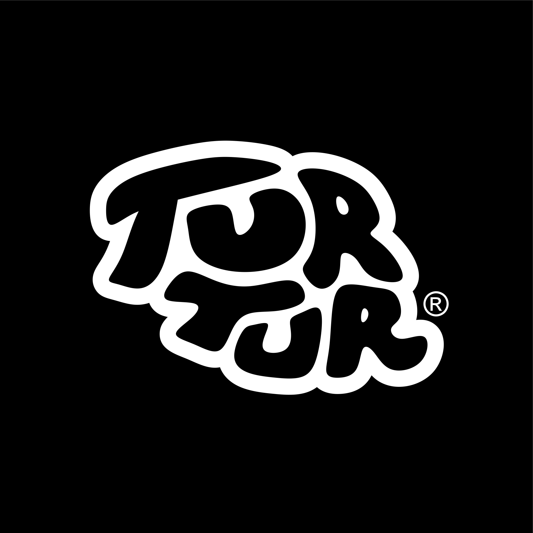
1. Wordmark (logotype).
Your full name set in a deliberate typeface. Google, Coca-Cola, Sony. A wordmark builds name recall faster than any other type — but only if the name is short, distinctive and easy to say. If your company is called “Northbridge Integrated Logistics Solutions,” a wordmark will fight you forever.
2. Lettermark (monogram).
Your initials, doing the work your full name can’t. IBM, HP, CNN, HBO. This is the rescue plan for long or awkward names. The trade-off: initials are abstract, so you’re asking the market to learn an association from scratch.
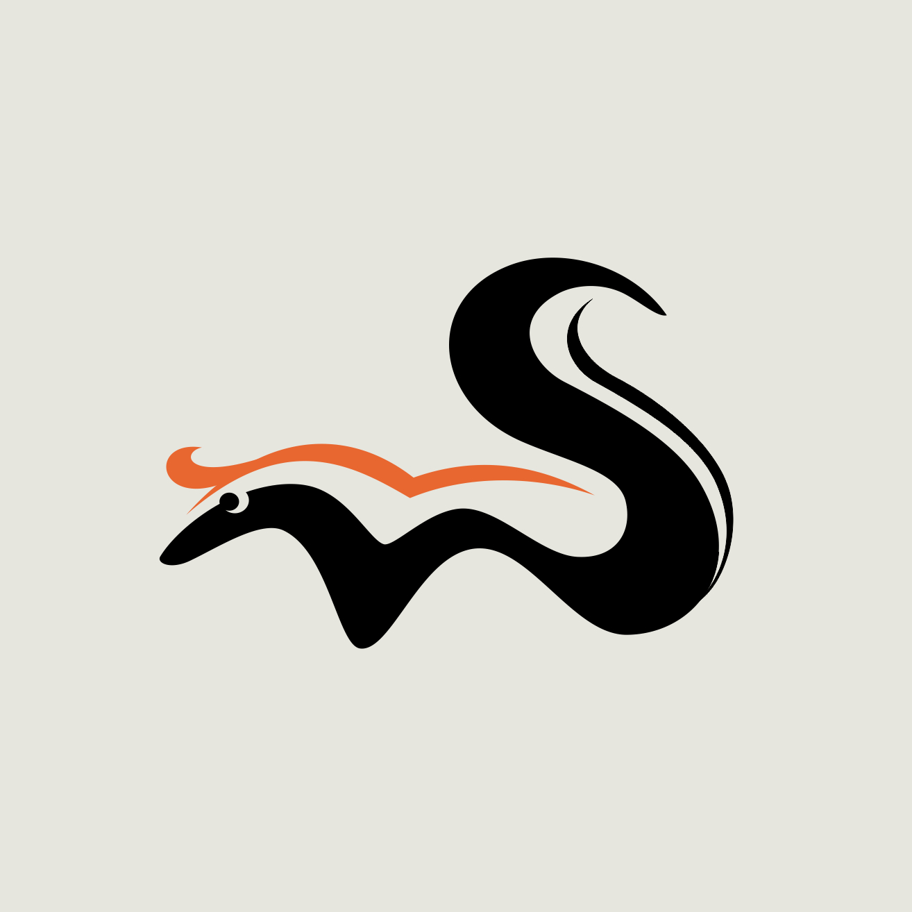
3. Pictorial mark (logo symbol).
A recognisable picture that is the brand — Apple’s apple, the Twitter bird. Enormous power once established, but it demands you’ve earned the recognition. A pictorial mark with no name attached is a flag for an army nobody’s heard of yet.
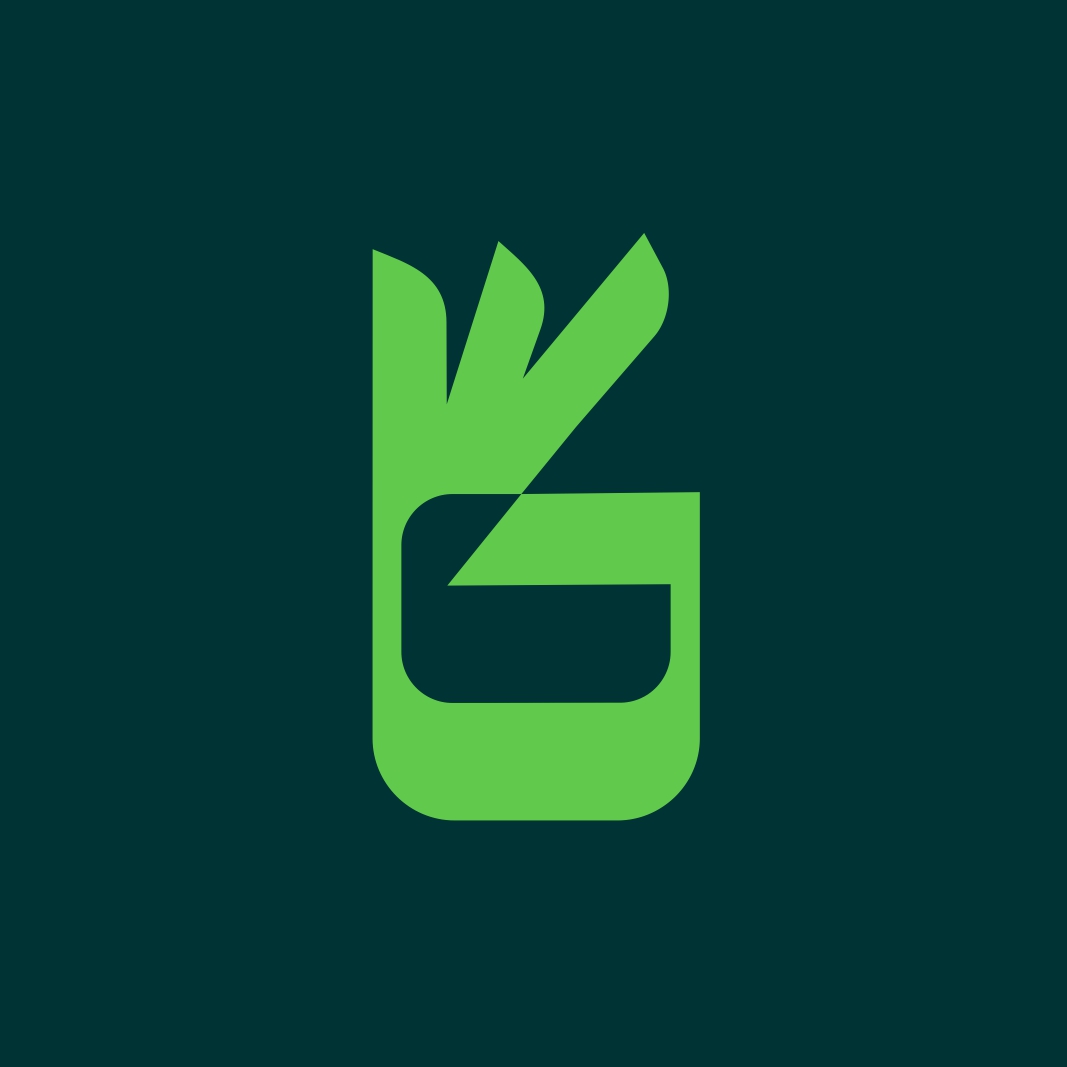
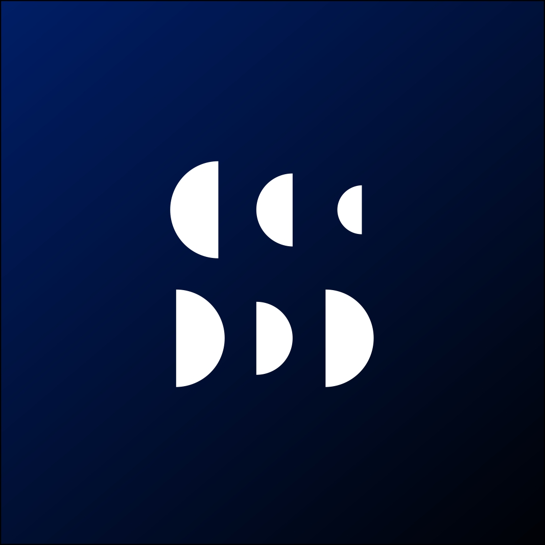
4. Abstract mark.
A bespoke geometric symbol that doesn’t depict anything literal — the Nike swoosh, the Pepsi globe. Abstract marks let you own a shape no competitor can claim and pour any meaning you like into it. The cost is the same as the pictorial: recognition has to be built and paid for over time.
5. Mascot.
A character that represents the brand. Warm, human, instantly likeable — and brilliant for businesses that talk to families or children. The catch is practical: detailed characters turn to mush at favicon size and can date faster than you’d like, so they almost always need a simplified companion mark.
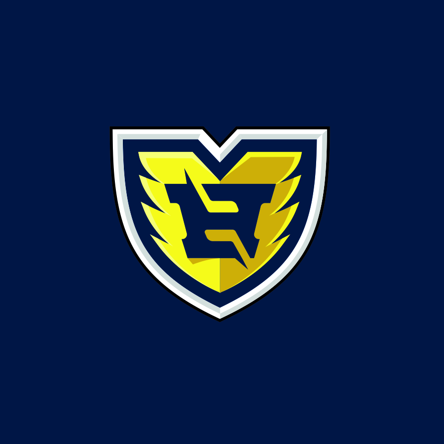
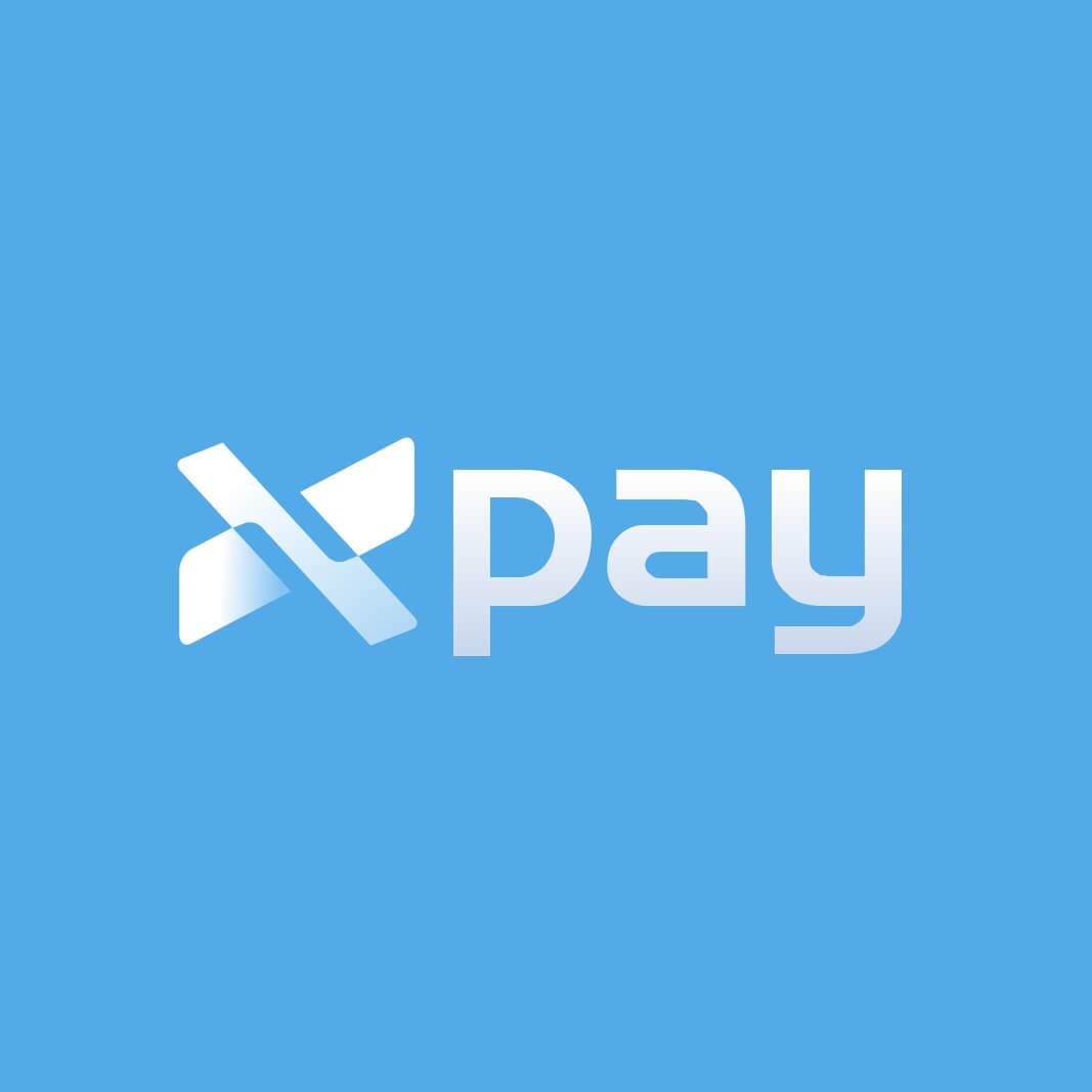
6. Combination mark.
A symbol plus a wordmark, locked up together — Adidas, Lacoste, Burger King. This is the Swiss Army knife. You get the name recognition of a wordmark and a symbol you can eventually use on its own once people connect the two. For most new businesses, this is the sensible default.
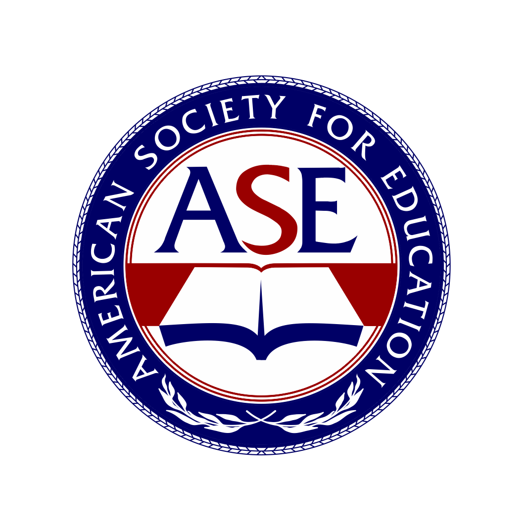
7. Emblem.
Text fused inside a symbol so the two can’t be separated — think badges, crests, seals. They radiate heritage, authority and craft, which is why universities, agencies and food brands love them. The downside is detail: emblems are hard to shrink and harder to reproduce cleanly on a stitched cap.
Stop choosing by looks. Choose by these four questions instead.
A logo type is the right one when it fits your situation, not your mood board. Run your business through these.
How long and how distinctive is your name? Short and memorable → a wordmark earns its keep. Long, generic or hard to spell → lean lettermark or combination mark and let a symbol carry the recognition.
How much will you spend, over years, building recognition? Pictorial and abstract marks are gorgeous and ownable, but a naked symbol means nothing until you’ve spent real money teaching people what it stands for. If you don’t have a multi-year marketing budget, a combination mark hedges that risk — the words explain the symbol while the symbol earns its keep.
What does your industry expect — and do you want to meet or break that expectation? A children’s brand can wear a mascot that would sink a wealth-management firm. An emblem signals tradition; a clean wordmark signals modern and direct. Knowing the convention lets you decide whether to fit in or stand out on purpose.
Where will the logo physically have to work? If your brand lives mostly as a tiny app icon and a social avatar, a fussy emblem or detailed mascot is a liability. Map the smallest and most hostile place your logo has to survive before you design for the pitch deck.
The honest recommendation for most small businesses
If you’re early, growing, and unsure: start with a combination mark. It’s the most forgiving choice. You promote your name and a symbol at the same time, and once people have connected the two — usually a year or two of consistent use — you can start deploying the symbol on its own, the way mature brands do. It buys you flexibility precisely when you have the least recognition to spend.
That said, “safest” isn’t always “best.” The reason it pays to design across types rather than commit on day one is that the strongest answer often only becomes obvious when you see your name as a wordmark next to the same idea as a combination mark. A good designer doesn’t ask you to pick a type from a menu — they show you your brand wearing two or three and let the right one announce itself.
That’s exactly how we approach every project at MalbarDesign: we explore the viable types against your name, your market and the places your logo has to live, then narrow to the one that will still be working a decade from now. If you’d like that done properly rather than guessed at, tell us about your logo project and we’ll show you the options.
One last practical note that trips up nearly everyone: whichever type you choose, make sure you receive it in the right file formats so it survives the jump from screen to print to signage. That’s a whole topic of its own — here’s exactly which logo file to use where.
FAQ
The seven main types are wordmarks, lettermarks (monograms), pictorial marks, abstract marks, mascots, combination marks and emblems. Each encodes your brand in memory through a different mechanism — names, initials, pictures, abstract shapes, characters or badges.
Usually a combination mark. It pairs your name with a symbol, builds recognition on both fronts at once, and gives you the flexibility to use the symbol alone later — which is the safest position when your brand is still new and unknown.
A wordmark spells out your full business name in a custom typeface (Google, Coca-Cola). A lettermark uses only initials or a monogram (IBM, HP) — ideal when the full name is long or hard to remember.
Can a business use more than one type of logo? Yes, and most established brands do. A combination mark is typically run as a system: the full lockup for primary use, the symbol alone for small spaces like app icons, and the wordmark alone where a picture would crowd the layout.
Why is a mascot logo risky? Mascots are full of personality but full of detail, so they lose clarity at small sizes and can feel dated over time. They almost always need a simplified secondary mark to work as a favicon or social avatar.
Yes, and most established brands do. A combination mark is typically run as a system: the full lockup for primary use, the symbol alone for small spaces like app icons, and the wordmark alone where a picture would crowd the layout.
Mascots are full of personality but full of detail, so they lose clarity at small sizes and can feel dated over time. They almost always need a simplified secondary mark to work as a favicon or social avatar.