
Color psychology in branding is the closest thing design has to a magic trick: it works on people before they know it’s happening. Long before a customer reads your name, parses your tagline or judges your logo, they have already absorbed your color — and formed a verdict. Research into snap product judgments puts a striking share of that first, fast assessment down to color alone. It is the part of your brand that speaks first, speaks fastest, and speaks even to people who never consciously listen. And most businesses choose it the way they choose a favorite — by personal taste, in an afternoon — which is rather like choosing the foundation of a house by which trowel feels nicest in the hand.
I have watched a color decision quietly reposition an entire company. A wellness brand drowning in the energetic reds of its competitors switched to a grounded, muted green and suddenly felt like the calm, trustworthy option it had always claimed to be — without changing a single word of its messaging. Color did the repositioning that copy couldn’t. This is the power on the table, and it is why color deserves far more than the afternoon most founders give it. Here is how color actually works on the human brain, the cultural traps that catch even large companies, and what the palettes of 2026 and 2027 are quietly signalin
Why Color Speaks Before Words
The reason color lands first is partly biological. Color is processed astonishingly fast and routes through the emotional centers of the brain before the slower, rational machinery of reading and reasoning engages. By the time a customer has consciously thought “this is a law firm,” they have already felt whether it seems serious or flippant, expensive or cheap, warm or cold — and color did most of that feeling.
This is why color is a positioning tool, not a decoration. It sets expectations the rest of the brand then has to meet. A premium price tag on a brand wearing bargain-bin colors creates a dissonance the customer can’t name but absolutely feels. Get the color right and everything else — logo, copy, packaging — is pushing in the same direction. Get it wrong and you spend the rest of your branding budget fighting your own first impression.
What the Colors Actually Do
The associations aren’t arbitrary; they’re a blend of biology, culture and decades of accumulated brand convention. The broad strokes, as designers use them:
Blue — trust, stability, competence. The reason it floods finance, tech and healthcare. Safe, sometimes to the point of invisibility; its very ubiquity can make a brand forgettable.
Red — energy, urgency, appetite, passion. It raises the pulse, literally, which is why it’s everywhere in food, clearance sales and anything that wants to feel immediate. Powerful, but exhausting in excess.
Green — nature, calm, health, growth — and, increasingly, sustainability. Its association with the natural has become so strong that, as I’ve written about packaging in 2026, generic “eco-green” can now read as greenwashing rather than credibility.
Yellow — optimism, warmth, attention. It catches the eye faster than almost any hue, which makes it a brilliant accent and a risky dominant.
Black — luxury, authority, sophistication. The shortcut to “premium,” which is exactly why so much premium branding looks identical, and why escaping black can be the more distinctive choice.
Purple — creativity, wisdom, a touch of the regal — historically the color of those who could afford the rarest dye, and it still carries that whisper of the exceptional.
These are starting points, not rules. The art is in the specific shade, the combination, and the context — a dusty sage and a neon lime are both “green” and signal opposite things.
The Cultural Trap
Here is where even large companies stumble: color meaning is not universal. White signals purity and weddings in much of the West and mourning in parts of the East. Red is luck and celebration in China, danger and debt elsewhere. A palette that reassures in one market can quietly alienate in another — a real consideration for any brand that, like many of my clients, works across borders.
The lesson isn’t to design for every culture at once, which produces beige mush. It’s to know your actual audience and choose deliberately for them, rather than assuming your own cultural reading is the world’s. Color is a language, and like any language it doesn’t translate automatically.
What 2026 and 2027 Are Signaling
Color trends are worth reading not as instructions but as a barometer of the cultural mood your brand is launching into. The current signals are revealing — and contradictory.
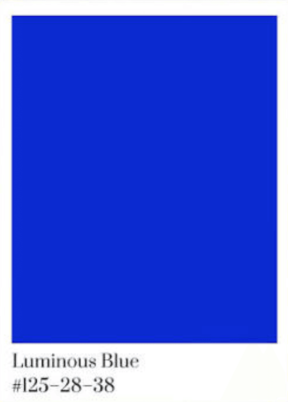
On one side, a yearning for calm. Pantone’s 2026 Color of the Year, the soft off-white Cloud Dancer, reflects a clean slate and quiet luxury meant to provide release from external distraction — according to Adobe’s analysis of the year’s color direction. The forecasters at WGSN, meanwhile, point toward grounded, nature-leaning tones; their and Coloro’s Color of the Year for 2027 has been announced as Luminous Blue, per design-trend forecasting coverage — a hue balancing dependability with a forward, futuristic optimism.
On the other side, rebellion. A loud, saturated maximalism is surging in direct revolt against a decade of sterile minimalism — palettes colliding on purpose, color cranked up rather than washed out. Both moods are real, and they tell you something useful: there is no single “correct” 2026 palette. There is only the palette that fits your brand’s character and the emotional register of your audience. Chasing the trend itself is how brands end up looking like everyone else who chased it.
How to Choose Color With Intent
If you’re choosing or revisiting your brand’s colors, resist starting with the swatches. Start with meaning:
- Define the feeling first. Three words you want a stranger to feel in the first two seconds. The palette serves those words; it doesn’t precede them. (This is the same discipline behind a good logo design brief.)
- Study your competitors’ colors — then diverge. If every rival wears blue, blue makes you invisible. Color’s first job is differentiation, and a deliberate departure can hand you the whole category’s attention.
- Choose for your real audience and markets. Their cultural reading, not yours. Design for who actually buys.
- Test the shade, not just the color. “Blue” is a thousand decisions. The specific value carries the meaning — the difference between trustworthy and cold is a few percent of saturation.
- Commit and stay consistent. Color compounds through repetition; the brands that own a color in your mind earned it by never wavering. This is precisely where brand consistency turns into recognition and revenue. For the practical, step-by-step mechanics of selection, I’ve written a companion guide on how to choose brand colors.
Your color is the first sentence your brand ever says, delivered before anyone chooses to listen, in a language that bypasses reason and speaks straight to feeling. Spend the afternoon — and then some — getting that first sentence right. Everything you say afterward is either supported by it or fighting it.
Wondering whether your brand’s colors are working for you or quietly against you? Get in touch — color is where I begin every identity, and the right palette is often the cheapest repositioning a brand can make.
FAQ
Color psychology in branding is the study of how color choices shape what people feel and assume about a brand — often before they read a word. Because color is processed fast and emotionally, it sets expectations of trust, price, energy and personality almost instantly.
There’s no universally best color — only the color that fits your brand’s personality, differentiates you from competitors and resonates with your specific audience. Blue signals trust, red energy, green calm and nature, black luxury, but the right shade and context matter more than the broad hue.
Yes. Research into rapid product judgments attributes a large share of that first impression to color alone, formed in seconds and before conscious reasoning. Color sets the emotional expectations the rest of the brand must then meet.
No. Color meaning varies significantly across cultures — white signals purity in much of the West but mourning in parts of the East; red means luck in China and danger elsewhere. Brands working across markets should choose for their actual audience, not assume a universal reading.
2026 holds a tension between calm (Pantone’s off-white Cloud Dancer, quiet luxury, nature tones) and a loud maximalist rebellion of saturated, clashing palettes. For 2027, WGSN and Coloro have named Luminous Blue. Trends are best read as cultural mood, not instructions.
Sources
AND Academy — Color Trends for 2026: https://www.andacademy.com/resources/blog/graphic-design/color-trends-for-designers/
Adobe Express — Color of the Year trends 2026 (Cloud Dancer, WGSN Transformative Teal): https://www.adobe.com/express/learn/blog/color-of-year-trends
Rachael Taylor Designs — 2026/2027 colour trends (Luminous Blue 2027): https://www.rachaeltaylordesigns.com/blog/2026/01/the-design-colour-trends-to-look-out-for-in-2026-2027.html